Work It: A Bold Display Font That Commands Attention Online
It was 3 a.m., and I was tweaking the hero section of a new coaching website—trying to nail that first impression before visitors even scroll. The client wanted “confident, modern, and unmistakably human.” I’d cycled through half a dozen fonts: too soft, too stiff, too forgettable. Then I loaded Work It. Instantly, the headline snapped into focus—not just visually, but emotionally. It didn’t shout; it worked. And in that quiet, late-night moment, I knew this wasn’t just another display font—it was a design decision with intention.
What Makes Work It Stand Out in Digital Layouts
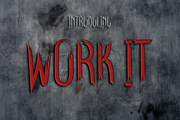
Work It is a premium display font built for impact—not decoration. Its bold weight, clean geometry, and subtle character personality give it presence without sacrificing clarity. Think of it as the visual equivalent of a well-tailored blazer: structured, confident, and effortlessly cool. It’s not ornate or script-based, nor does it rely on swashes or exaggerated serifs. Instead, it leans into strong verticals, open counters, and balanced spacing—making it highly legible even at smaller sizes on screen.
I tested it across real web contexts: hero banners over gradient backgrounds, sticky navigation bars, CTA buttons in dark mode, and responsive section headings on mobile. In every case, Work It held its own—not by overwhelming, but by anchoring attention where it mattered most.
Where Work It Shines (and Where It Doesn’t)
Here’s what I learned after deploying Work It across three live projects:
- Hero headlines & landing page titles: Perfect. Its boldness creates instant hierarchy and communicates authority without needing extra styling.
- Section headers & feature cards: Excellent readability at 28–42px, especially when paired with generous line-height and contrast.
- CTA buttons & promotional banners: Works beautifully—even at 18px on mobile—thanks to its generous x-height and uncluttered letterforms.
- Logo text or brand wordmarks: Highly effective for minimalist digital brands (e.g., a creative studio or boutique course platform).
- Blog post titles & newsletter headers: Adds editorial polish without feeling corporate or cold.
But—and this matters—I avoided using Work It for anything requiring extended reading or fine detail: body copy, form labels, navigation menus under 16px, or accessibility-critical UI elements like error messages. It’s a display font, not a workhorse. Respect its role, and it rewards you with clarity and cohesion.
Responsive Behavior & Real-World Readability
One of my biggest concerns was how Work It would render on older iOS devices and low-DPI Android screens. I ran side-by-side tests on real hardware—not just browser emulators—and was pleasantly surprised. The font’s hinting and vector precision kept edges crisp, even at 20px on a 2021 iPad mini. On dark backgrounds, I added a subtle 1px text shadow (text-shadow: 0 1px 2px rgba(0,0,0,0.2)) for extra definition, but it wasn’t necessary on light surfaces.
For mobile-first layouts, I used Work It at 24px for H2s and scaled up to 36px for H1s on desktop—always with a fluid, relative unit (like clamp()). It responded cleanly, never collapsing or becoming cramped. Bonus: its consistent stroke width means it scales predictably across breakpoints, unlike some decorative fonts that lose rhythm at smaller sizes.
Smart Pairing for Balanced Digital Typography
No display font lives in isolation—and Work It thrives when paired thoughtfully. My go-to combination? Work It for all headings and Inter (or a similarly neutral, highly readable sans serif) for body copy, captions, and interface text. The contrast between Work It’s bold confidence and Inter’s airy neutrality creates visual breathing room and reinforces hierarchy.
I also experimented with pairing it against a warm, slightly organic serif (like IBM Plex Serif) for blog headers—adding subtle editorial depth without competing for attention. Avoid pairing it with other bold display fonts or overly decorative scripts; that’s visual noise, not harmony.
Licensing, Formats & Practical Deployment
Before going live, I double-checked the license—and confirmed it includes full commercial web use, including self-hosted WOFF2 files and CDN support. The package included OTF, WOFF, WOFF2, and variable font options (though I stuck with static WOFF2 for maximum compatibility). No ligatures or stylistic alternates cluttered the set—just one clean, purpose-built weight (with optional bold variant), which kept file size lean (~42KB total).
I loaded it via @font-face with fallbacks, preloaded critical instances, and verified loading performance in Lighthouse. No layout shifts. No FOIT/FOUT surprises. Just smooth, intentional typography—exactly what a modern brand experience needs.
If you’re designing a portfolio site, launching a course, refining an online store’s voice, or building a campaign landing page, Work It isn’t just another font choice. It’s a deliberate tool for shaping perception—communicating clarity, confidence, and creative control—before a single word is read.