Thole: A Futuristic Display Font That Stands Out—Not Just in Theory
I opened a fresh brand board for a local ceramic studio last week—no brief, no mood board yet, just a quiet afternoon and the kind of creative freedom that makes you reach for something unexpected. I typed “Clay & Co.” in a few candidate fonts, then dropped in Thole. Instant pause. Not because it was loud or flashy, but because it felt *charged*: clean lines, subtle geometry, and this quiet confidence that didn’t shout—it leaned in.
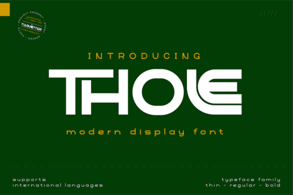
Thole is a display font through and through—designed not to blend, but to anchor. It’s cool without being cold, futuristic without leaning into sci-fi tropes, and unique without sacrificing legibility at a glance. Think sharp terminals, balanced negative space, and a rhythm that feels both precise and hand-tuned. It’s not retro-futurism or glitch art—it’s more like what typography might look like if it evolved alongside minimalist architecture and tactile ceramics: grounded, intentional, quietly bold.
Where Thole Actually Shines (and Where It Doesn’t Pretend To)
In logo design? Absolutely—but with nuance. I tested Thole on the studio’s primary wordmark and a secondary monogram lockup. At 48pt and above, its structure held beautifully. The uppercase “C” and “O” have gentle, confident curves; the lowercase “a” and “e” carry enough openness to avoid tightness. But I wouldn’t use it below 32pt on a business card—or worse, as body copy. It’s not built for paragraphs, footnotes, or ingredient lists. And that’s fine. Thole knows its role: headline, hero, identity signature.
On packaging mockups—especially matte-finish ceramic labels and uncoated kraft boxes—Thole added weight and distinction without competing with texture. Its letterforms hold up well in single-color foil stamping and screen printing. I tried it in black on cream, navy on oat, and even soft terracotta on off-white—and each time, it read as deliberate, not decorative.
For social media graphics? It works best in vertical compositions: Instagram story headers, Pinterest pin titles, or banner overlays where you’ve got visual breathing room. On a crowded feed, Thole’s clarity cuts through—but only when used sparingly. One line. One idea. Let it land.
What Happens When You Pair It (and What to Avoid)
Thole thrives in contrast. I paired it with a warm, low-contrast serif (think a sturdy Garamond variant) for editorial layouts—like a small-run studio zine—and the combination felt grounded yet forward-looking. With a neutral sans serif (a restrained geometric like Poppins Light or Inter Regular), Thole became the voice of authority in a brand system: commanding headlines over calm, functional text.
Avoid pairing it with other display fonts unless you’re intentionally building a high-energy, multi-layered visual language—like a music festival identity. Even then, test spacing rigorously. Thole’s x-height and cap height are generous, so stacking two expressive typefaces can easily tip into visual noise.
No script or handwritten fonts in the same hierarchy—not unless you’re using them *very* selectively as accent elements (e.g., a single “hand-thrown” tagline beneath the Thole logo). Thole doesn’t need embellishment. Its personality is self-contained.
Real Testing Notes: File Formats, Styles, and Licensing Reality Checks
The version I used included OTF and WOFF2 files—clean, well-hinted, and lightweight. No missing glyphs, no rendering hiccups in Figma or Illustrator. It supports Latin-based languages (including accented characters common in French, Spanish, and German), which mattered for the studio’s upcoming EU wholesale packaging. No Cyrillic or extended diacritic support, though—so if your project spans broader multilingual needs, double-check before committing.
There’s one weight (Medium), no italics or bold variants—but that’s part of its strength. Thole isn’t trying to be a system; it’s a statement. If you need typographic flexibility, pair it thoughtfully rather than stretch it beyond its intent.
And here’s the non-negotiable: always verify commercial licensing. Thole is a premium font, and while personal use may be covered under standard terms, client work—especially for packaging, merchandise, or web templates—requires explicit commercial rights. I once assumed a license covered Shopify product pages, only to realize mid-launch it didn’t include webfont embedding. Save yourself the revision: check the license *before* finalizing mockups.
A Few Honest Limits—Because Good Design Is Honest
Thole won’t solve vague branding briefs. It won’t make weak concepts feel stronger. And it’s not the right choice for a law firm’s letterhead, a university syllabus, or a medical device manual—contexts where neutrality, familiarity, and ultra-high readability are non-negotiable.
It also demands thoughtful sizing and spacing. In tight grid layouts—like a dense product catalog or multi-column brochure—I found myself adjusting tracking manually. Its default kerning is solid, but not magic. Give it room. Let it breathe. That’s where it earns its keep.
If you’re designing for screens with variable DPI (like some Android devices), preview Thole in real browser conditions—not just static mockups. Its thin strokes and open counters hold up well, but very small responsive headers (<24px) start to lose definition.
Final Thought—Not a Conclusion, Just a Note
Thole isn’t “versatile” in the way a Swiss-style sans is. It’s not meant to disappear into the background. It’s a display font that asks to be seen—and rewards attention with quiet sophistication. Use it where you want people to pause, recognize, remember. Not everywhere. Just where it matters most.